

Design Challenge • Saucey • 2 hour challenge
Design Challenge
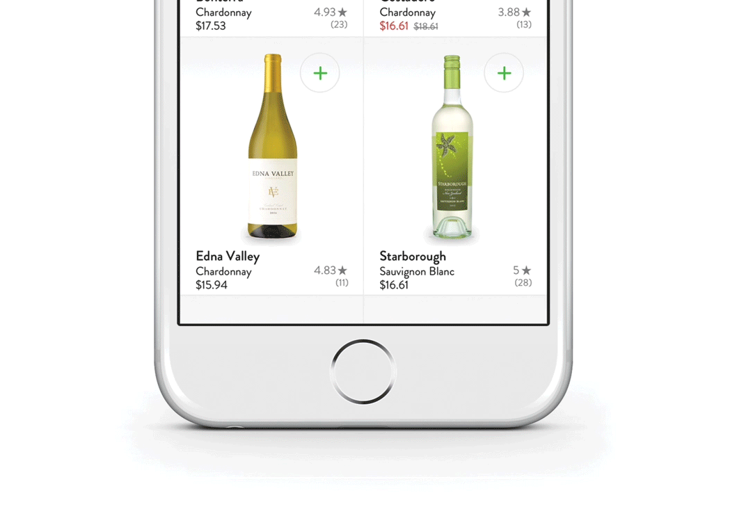
Saucey is a mobile app that delivers alcohol to your door in under 30 minutes. Saucey wants to increase purchase volume in a fast and easy way. Today, users can only add an item to cart from the product details view. To increase purchase volume, we want to provide users with ability to add items to their cart directly from the product grid view without having to visit the product details screen.
Increasing Purchase Volume
When thinking of ideas on how to increase “purchase volume” in the shopping experience, I started with ways it is currently done today in the real world and kicked off a quick list of ideas. I wanted these ideas to guide me. Here’s what came to mind:

Research & Inspiration
I wanted to review other players in the online wine market to get ideas on what current experiences are like. I also wanted to gauge online mobile shopping experiences from others in the on-demand food delivery business. Below are some of my observations from just some of the apps I reviewed.

Sketches
Below are early sketches of ideas I explored. From info buttons that displayed product ratings and item details to displaying the volume size of the items themselves.

Early explorations on presentation, feature, and interaction.
Interactions & Flows
The following flow outlines the steps and micro interactions that take place in the experience. There are subtle actions shown here from haptic feedback to visual feedback when adding items to cart. Not to mention the quick sorting options to minimize shopping time.

The prototype below illustrates the flow above. Given the time scope of the project I limited the prototype to standard interactions to walk through the userflow.
Prototyping
Final Thoughts
While improving upon the design in the grid view to increase purchase volume, it was important to be mindful of negative impacts in other areas of the screen. The user is still one interaction from search or filtering however now has more access to tools that speed up decision making and shopping. A budget conscious consumer can better control their shopping experience with less friction with the viewable sorting options, a user unsure of which Sauvignon Blanc to go with might use the product rating system, created by other wine lovers, to make a quick purchase decision versus leaving the app to review the product elsewhere. And lastly, users are now incentivized to add more items to cart to qualify for FREE delivery.
